

In the world of data analysis and business strategy, a Pareto Chart is a significant tool. Learn how to read a Pareto Chart effectively to decide business strategies, increase efficiency, and improve customer satisfaction. Below, we will guide you through the steps on how to master the art of reading a Pareto Chart.
Table of Contents
Understanding the Basics of Pareto Chart

Alt Text: “The 80/20 Principle: The Secret of Achieving More With Less” by Richard Koch
A Pareto Chart is a type of chart that presents categorical data in a sorted format, with the largest variables on the left and the smallest on the right. It highlights the most important factors in a data set. This is based on the Pareto Principle, also known as the 80/20 rule.
The Pareto Principle refers to the concept that 80% of the effects result from 20% of the causes. In simple terms, it’s a method to identify significant factors in a data set.
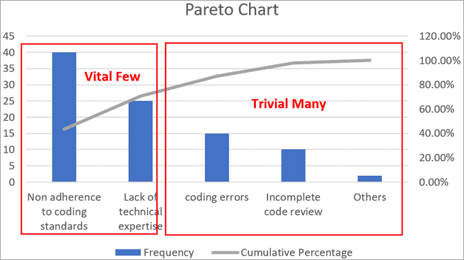
Pareto Charts are a combination of a bar graph and a line graph. The bar graph represents individual values, whereas the line graph signifies the cumulative total percentage.
These charts have a reputation for being challenging to comprehend, but once mastered, they become valuable tools in isolating and addressing critical issues in almost every facet of life.
Key Components of a Pareto Chart
The Pareto Chart is composed of a few key components. Understanding these elements can provide a deeper insight into the messages that the chart communicates.
The first component is the categories. These are represented by the individual bars on the chart. Each category represents a type of issue or factor contributing to the larger problem or situation.
The second element is the frequency, which is the height of each bar. A higher bar means that the issue it represents crops up more frequently and is therefore more significant.
The third element is the cumulative percentage line. This line starts at the first bar and ends at 100% on the right. As the description implies, this line demonstrates the cumulative percentage of frequencies as you move from left to right across the chart.
A Guide To Reading a Pareto Chart

Alt Text: An 80/20 Pareto Principle mug.
Reading a Pareto Chart is more than just looking at the bars and figures. It’s about understanding different aspects of the chart and putting them together to produce strategic insights.
While reading a Pareto Chart, the first thing to notice is the order of the bars. The bars should be arranged in descending order starting from the left. The issue with the highest frequency should be the first bar on the left.
Then, look at the overall trend of the bars. A bar that stands significantly higher than the rest indicates a major issue that contributes disproportionately to the total.
Finally, analyze how quickly the cumulative line grows as it moves to the right. A sharp rise reflects a few key problems that constitute the majority of the issues.
The Importance of Pareto Chart in Data-Based Decision-Making
Data-based decision-making is an integral part of any successful organization, and the Pareto Chart plays a significant role in this process.
When used correctly, a Pareto Chart can be a catalyst for profound organizational improvements. They help businesses identify the critical causes of their problems.
Pareto Charts offer a visual representation of problems and issues, making them easy to understand. This can facilitate discussions and shared understanding.
Overall, understanding how to read a Pareto Chart can lead to better data interpretation, strategic decision-making, and ultimately, a more successful business.
